Colors have their magic and effect on our moods and behaviors. They change the vibe and make us feel differently. With different elements like warm, cool, and neutrals, these colors emit a vibe that rests with us bringing about a change in our temperament too. The color scheme is integral to making an impact on the user. This is the reason why most the web designers emphasize creating their color mix for designing logos, backgrounds, etc.
Color plays a very vital role in defining how the website shall appeal to the audience. Covering aspects like the navigation bar, logo, fonts, backgrounds, etc. Web Design Company creates several hues of colors to bring that perfect balance. Because colors, their tones, elements, and hues should complement each other and create a balance for the best visuals! Here is how they try to master color theory for web design.
Also Read – The Complete List of Top 19 Best SEO Tools For Website
Color Considerations When Designing!
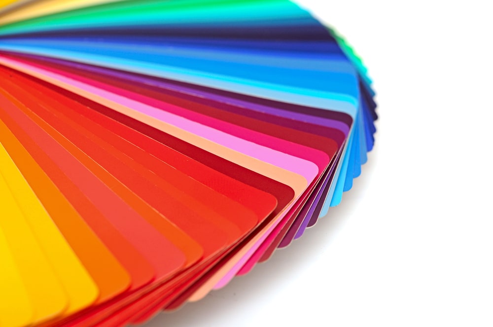
The color palette has several shades defining several different emotions for different people. These can be best understood as elements. Colors like red, maroon, orange, etc are called warm colors motivating, invigorating, and creating a sense of warmth in the audience. The colors like purple, blue, and green are called cool colors as they have sedative tendencies making one feel light, liberated, and free. And then there are neutrals like yellows, whites, off-whites, mustard, etc. which pacify the shades of other colors while emitting strong positive vibes. The balance between warm and cool colors helps create a subtle palette that creates a good effect on all. Web designers can aim to use these colors smartly to express their vision as per their likes.
Also Read – 10 Must Have for a Business Website In 2020 With Infographics
Defining a Hierarchy of Colors on the Web Page
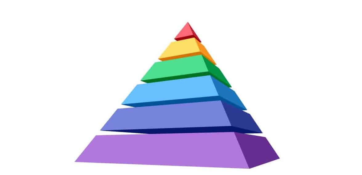
Colors have several facets depending on how deep or how subtle they are! The deepest of orange and the lightest of orange are two different colors altogether. It is important here to define the hierarchy of colors and choose the shades as per your choice. Start with aligning the colors as per their strength. Dark to light, light to dark, or theocratic can look effective when you are playing with one or two colors only. Websites that have only one single color running through the web page in one single shade are often negative and too bright to handle. It is best to define the color choice with some open space, irregular placement of dark colors, or allowing some grid space. Play with light and dark shades to create a hierarchy of colors.
Also Read – Top High DA 650+ Forum Submission Sites List For Forum Posting
Following a Color Scheme
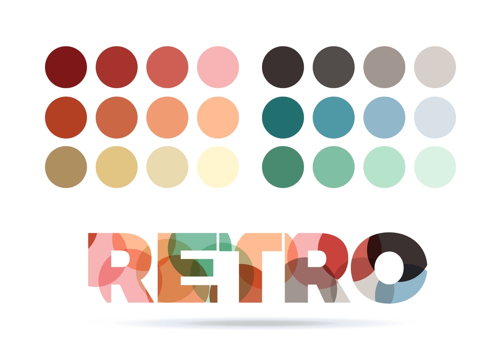
It is but an exciting process to blend two or more colors and play with their hues all over the website. Blending colors can give ample freedom to use for the logo, blend shades for the background, and many more ideas. Here you have to select the shades from the color palette as per the patterns that best bring together the warm, cool, and neutrals together. Form shapes like triangles, squares or splits complementary colors in the color palette to pick the right balance of shade and make the web design replicate their hues. It brings out the beauty of three or more colors together to form a unique hue that emits strong, positive, and communicative touch to the website.
Also Read – 10 Latest Home Tech Gadgets Make Your Life Easy
The Best Color Schemes For The Web!
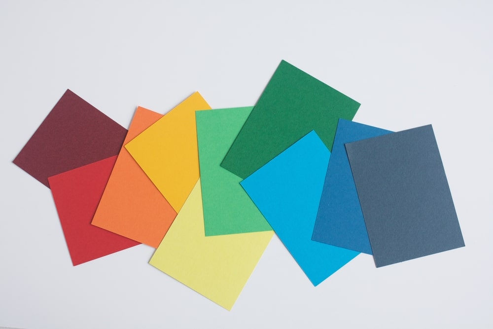
Some of the most popular websites are known to use blue and white, purple and off-white, white and rainbow, etc like the basic color scheme identifying the moods of the websites. These colors have been known to define the right balance for designing the web. A Web Design company would suggest going for the best-known choices like cherry red- corn silk-dark turquoise, tangerine-gold-yellow green, silver-gray- tomato red, etc for the web color scheme to make the most impact. Other popular choices include midnight blue–cream–pastel yellow, fuchsia–rose–pearl–grey, and beige-yellow-cinnamon as the ultimate choice depending upon the vision of the website. You can pick up from widely known colors or designs on your own.
Also Read – How to Download Photos from Instagram to a Computer
Emotional Complications of Colors
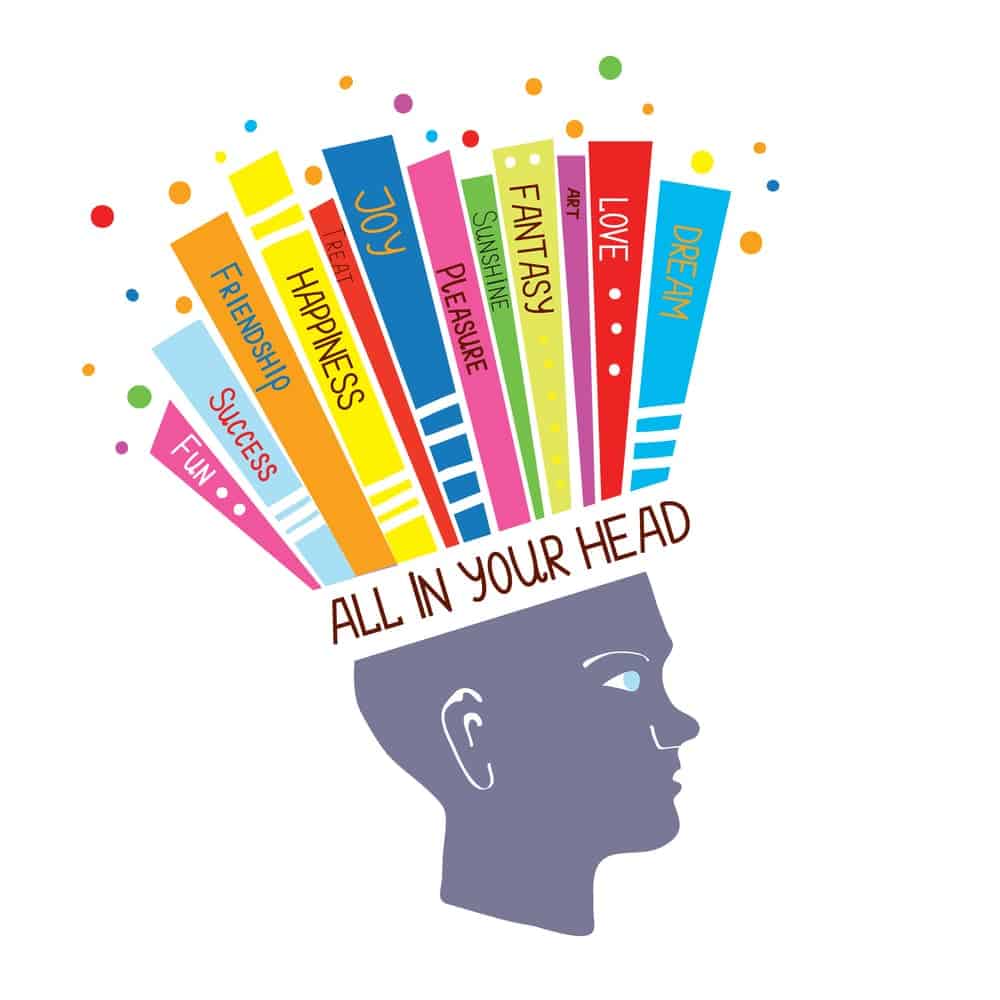
The psychological impact of the colors has been defined ever since medieval history. The implementation of colors pair with the emotional impact they create to strengthen a website’s appeal. Harness the choices with the right colors to convey what you want. Red, for instance, reveres a passionate, energizing, and loving feeling, but it also brings power, and importance and attracts attention. White, on the other hand, stands for peace, simplicity, and vibrancy. This could work for you or against you – depends on the product, belief, and design of the website too. To lighten up the impact you can choose to lighten the shades and pick a more positive note and cut down on the negative effects.
Also Read – All SEO Trends To Look For In 2020 [Must Visit]
Pop Colors Could a Good Idea Too!

Some of the quirky brands have used pop colors like neon oranges, sea greens, turquoise, etc to bring together some retro vibes and quirkiness to the website. This instantly levels up the website’s appearance and stands out. For connecting with the youth – a more pop and quirky design with bright colors could work. But for the generic audience, it is always the subtleness of the web design that appeals. Select the pop colors for a breakthrough product or create a different vibe for the company. Keep the feel subtle if you want to play with the synergy of all of your audience.
Also Read – The 5 Best Grammar Checkers 2020 You Need To Know
The Power of Black!

Most tech websites are known to stick with either white or dark black for their representation. It is the strongest of all neutral colors in the color scheme. As a primary color on the website, it brings sophistication, power, and edginess to the website. Black can also be evil and negative, which is when you can use shades of white and gray to balance its effect and craft a unique design. If you are bringing a more sophisticated layout with simplicity – black works magically for you!
Carry the colors you choose with some extra weight of emotions, expressions, and magic. As the colors define influence on your audience, they have to be precise and visually digestible to them for the website to be a pleasing browse!

